In the one on the left you have a beautiful landscape of possibilities, on the right, a generic "kickass girl" who looks to be about half the age of the main character in the book. The other problem with this is that this is the only book updated in the series so it does not match the rest which is a huge pet peeve of mine (I know first world problems)


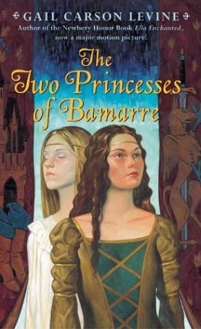
On the left an artist rendition, that captures the look and mood perfectly, on the right two tweeny bopper looking girls in a princess costume (seriously the darker haired one does not even have an attempt at a medievalish hairstyle)


This one is not as bad as some, they at least kept the white hair, but the expression on the right...bugs me. It makes it look much more "I am the great and powerful sorceress who is prone to shoot lightning bolts out of my eyes" rather then "I am a lonely, yet hardworking telepath who was orphaned at a young age, but can still quietly and calmly kick all of your assess" that the character is really about.


Again we have an artists rendition on the left, a scene straight out of the book, given the tone may be a bit dated, but still a decent cover. Cover on the right gets the coloring of the character right, but again that expression of pained model just makes me want to laugh, the rest of the updated covers on this series are pretty much the exact same expression, just from different angles, so not only silly, but uncreative as well.


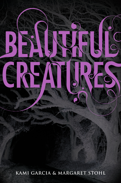
Here is an example of how movies ruin books (full disclosure I have not read the book yet, but it is on my shelf on the short list) The cover on the left is haunting and sinister and just makes you want to open up the book to see what is down the road. The cover on the right is generic pretty people who are cast in the movie because they are pretty people and now they are on the cover of my book to remind me that everything must get made into a mass media form at some point!
Updated covers are not always a bad thing, in fact I think I own at least three different version of The Lord of The Rings trilogy and who knows how many of the Chronicles of Narnia because for the most part every new update is awesome (hmmm maybe I'll do a post with a progression of awesome covers). I am just sick and tired of every book I love and grew up with being blanded down (that's a real word/term I swear) to try and attract more readers. I however do not want a bookshelf full of pout teenagers staring back at me, I want some creativity and thought. This is why the publishers should allow the author more input into the covers of their own books.
What is your favorite kind of book cover? How much does the cover play into the nostalgia factor for you? Do you prefer the pouty pretty people? Do I have way to much time on my hands to be this upset over a stupid book cover?
What is your favorite kind of book cover? How much does the cover play into the nostalgia factor for you? Do you prefer the pouty pretty people? Do I have way to much time on my hands to be this upset over a stupid book cover?
Hun, you may have your right and left reversed for the first couple of posts. Time to check the lettering on your shoes again! :)
ReplyDeleteHad my shoes on backwards for a bit...wondered why my feet hurt :-) got both my shoes and the post fixed
Delete